

STICKY NAVIGATION BAR (MENU) WHILE SCROLLING
CREATE STICKY NAVIGATION BAR (MENU) WHILE SCROLLING
If your navigation bar is under your header and you want it to stick to the top of the window when you scroll past it then follow this tutorial.
Add the following in your Style sheet
/* Sticky Navigation Bar */
]]></b:skin>
sticknav {
background: #ffffff; /* change as you need in your theme */
height: 30px; /* change as you need in your theme */
width: 100%; /* change as you need in your theme */
margin-right: 0px; /* change as you need in your theme */
left: 0px;
position: relative;
z-index: 9999;
}
.fixed { position:fixed;
}
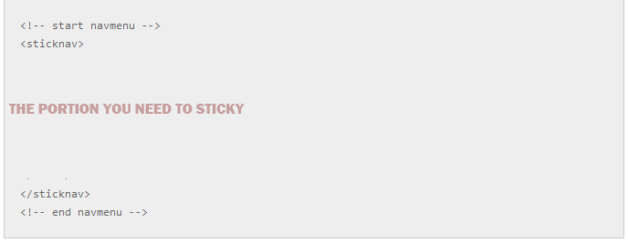
Next, you’ll need to set up your navigation. go to your header file and wrap the header (the portion you need to sticky while scrolling ) with “sticknav ” class some thing like this
The final step is to add a script to tell the bar to scroll. To do this go to header and paste the following script
<script type=”text/javascript” src=”http://ajax.googleapis.com/ajax/libs/jquery/1.6.4/jquery.min.js”></script>
<script type=”text/javascript”>
$(document).ready(function() {
//Calculate the height of <header>
//Use outerHeight() instead of height() if have padding
var aboveHeight = $(‘header’).outerHeight();
// when scroll
$(window).scroll(function(){
//if scrolled down more than the header’s height
if ($(window).scrollTop() > aboveHeight){
// if yes, add “fixed” class to the <sticknav>
// add padding top to the #content (value is same as the height of the sticknav)
$(‘sticknav’).addClass(‘fixed’).css(‘top’,’0′).next().css(‘padding-top’,’60px’);
} else {
// when scroll up or less than aboveHeight, remove the “fixed” class, and the padding-top
$(‘sticknav’).removeClass(‘fixed’).next().css(‘padding-top’,’0′);
}
});
});
</script>
See your page now ! it will work
